メジャーリーガーの誕生月と相対年齢効果
2026-08-09
メジャーリーガーの誕生日に偏りはあるのか, を見ます.
library(dplyr)
library(ggplot2)
library(Lahman)
library(knitr)
月ごとの人数をそのまま数えてはいけない
2月は28日, 1月は31日しかありません. 月ごとの人数をそのまま比べると, それだけで1割ほどの差が出ます.
1日あたりの人数に直してから比べます. 以下では全体平均を100とした指数で示します.
days_in_month <- c(31, 28.25, 31, 30, 31, 30, 31, 31, 30, 31, 30, 31)

## 出現しない月があってもよいように、月をキーにして日数を結合する
birth_index <- function(d, label) {
  tibble::tibble(birthMonth = 1:12, 日数 = days_in_month) |>
    left_join(d |> filter(!is.na(birthMonth)) |> count(birthMonth, name = "人数"),
              by = "birthMonth") |>
    mutate(人数 = tidyr::replace_na(人数, 0L),
           一日あたり = 人数 / 日数,
           指数 = 一日あたり / mean(一日あたり) * 100,
           区分 = label)
}
米国生まれの選手
出身国によって学年の区切りが違うので, まず米国生まれに絞ります.
usa <- People |> filter(birthCountry == "USA")
idx_usa <- birth_index(usa, "米国生まれ全選手")
idx_usa |> select(月 = birthMonth, 人数, 一日あたり, 指数) |> kable(digits = 2)| 月 | 人数 | 一日あたり | 指数 |
|---|---|---|---|
| 1 | 1669 | 53.84 | 99.10 |
| 2 | 1534 | 54.30 | 99.95 |
| 3 | 1630 | 52.58 | 96.79 |
| 4 | 1525 | 50.83 | 93.57 |
| 5 | 1517 | 48.94 | 90.08 |
| 6 | 1445 | 48.17 | 88.66 |
| 7 | 1645 | 53.06 | 97.68 |
| 8 | 1943 | 62.68 | 115.37 |
| 9 | 1814 | 60.47 | 111.30 |
| 10 | 1819 | 58.68 | 108.01 |
| 11 | 1662 | 55.40 | 101.98 |
| 12 | 1642 | 52.97 | 97.50 |
8月が最も多く (指数115), 6月が最も少ない (指数89) という結果です. 30%もの差があります.
なぜ8月なのか
米国の少年野球 (リトルリーグ) は長らく 7月31日 を学年の区切りにしていました. 8月1日生まれの子は, その学年でいちばん年上になります.
同学年の中で年上ということは, 体格も運動能力も先に発達しています. 選抜され, 良い指導を受け, 出場機会を得やすい. その積み重ねがプロになる確率の差として残る — これが相対年齢効果です.
グラフにすると, 8月を先頭にして緩やかに下がっていく形がはっきり出ます.
idx_usa |>
  mutate(区切りからの月数 = (birthMonth - 8) %% 12) |>
  ggplot(aes(x = factor(birthMonth), y = 指数,
             fill = birthMonth == 8)) +
  geom_col() +
  geom_hline(yintercept = 100, linetype = "dashed") +
  scale_fill_manual(values = c("grey60", "tomato"), guide = "none") +
  xlab("誕生月") + ylab("1日あたりの人数 (平均=100)") +
  ggtitle("米国生まれメジャーリーガーの誕生月")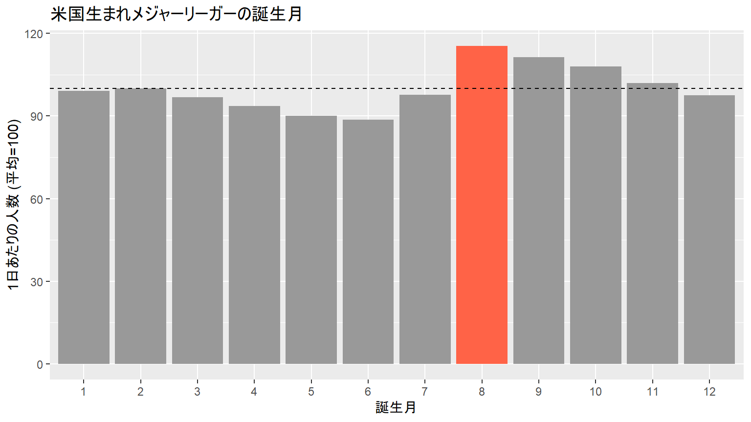
学年の区切り (8月1日) からの経過月数で並べ直すと, より素直に見えます.
idx_usa |>
  mutate(学年内の月順 = (birthMonth - 8) %% 12) |>
  ggplot(aes(x = 学年内の月順, y = 指数)) +
  geom_col(fill = "grey60") +
  geom_smooth(method = "lm", formula = y ~ x, se = FALSE, colour = "tomato") +
  geom_hline(yintercept = 100, linetype = "dashed") +
  scale_x_continuous(breaks = 0:11,
                     labels = c("8月", "9月", "10月", "11月", "12月", "1月",
                                "2月", "3月", "4月", "5月", "6月", "7月")) +
  xlab("学年の区切り(8月1日)からの月数") + ylab("指数") +
  ggtitle("学年内で年上なほど多い")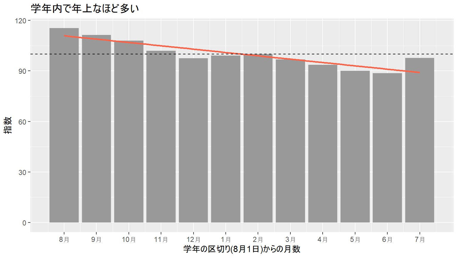
fit <- lm(指数 ~ I((birthMonth - 8) %% 12), data = idx_usa)
summary(fit)$coefficients |> round(3)
## Estimate Std. Error t value Pr(>|t|)
## (Intercept) 110.909 2.177 50.948 0
## I((birthMonth - 8)%%12) -1.983 0.335 -5.916 0学年の中で1か月遅く生まれるごとに, 指数が2.0ずつ下がります.
検定
「誕生日は日数に比例して一様」という帰無仮説を検定します.
chisq.test(idx_usa$人数, p = days_in_month / sum(days_in_month))##
## Chi-squared test for given probabilities
##
## data: idx_usa$人数
## X-squared = 120.15, df = 11, p-value < 2.2e-16一様とは言えません.
長く活躍した選手ではどうか
相対年齢効果が「プロになれるかどうか」に効くのは分かりました. では「プロになった後, 長く活躍できるか」にも効くのでしょうか.
10年以上プレーした選手に絞って比べます.
usa_long <-
  usa |>
  mutate(在籍年 = as.numeric(substr(finalGame, 1, 4)) -
                  as.numeric(substr(debut, 1, 4))) |>
  filter(!is.na(在籍年), 在籍年 >= 10)

idx_long <- birth_index(usa_long, "10年以上")

bind_rows(idx_usa, idx_long) |>
  ggplot(aes(x = factor(birthMonth), y = 指数, fill = 区分)) +
  geom_col(position = "dodge") +
  geom_hline(yintercept = 100, linetype = "dashed") +
  xlab("誕生月") + ylab("指数") +
  ggtitle("全選手と長く活躍した選手の比較")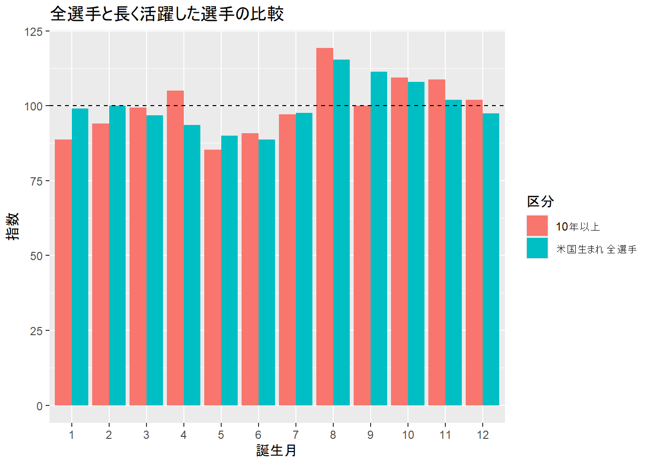
bind_rows(idx_usa, idx_long) |>
  summarise(`8月の指数` = 指数[birthMonth == 8],
            `6月の指数` = 指数[birthMonth == 6],
            `8月/6月` = 指数[birthMonth == 8] / 指数[birthMonth == 6],
            .by = 区分) |>
kable(digits = 3)| 区分 | 8月の指数 | 6月の指数 | 8月/6月 |
|---|---|---|---|
| 米国生まれ全選手 | 115.373 | 88.663 | 1.301 |
| 10年以上 | 119.338 | 90.864 | 1.313 |
比は全選手で1.30, 10年以上で1.31です. ほとんど変わりません。
これは考えてみれば自然です. いったんメジャーに上がってしまえば, 生まれ月による数か月の発達差はもう関係ありません. 相対年齢効果は「選抜される段階」で効き, その後は消えます.
3193人しかいないので, この比較の精度は高くありません. はっきりした差があれば見えるはず, という程度に受け取ってください.
米国以外の選手
参考までに, 出身国別に見ます. 学年の区切りが違えばピークもずれるはずです.
top_countries <- People |> count(birthCountry, sort = TRUE) |> head(4) |> pull(birthCountry)

People |>
  filter(birthCountry %in% top_countries) |>
  group_split(birthCountry) |>
  lapply(\(d) birth_index(d, d$birthCountry[1])) |>
  bind_rows() |>
  ggplot(aes(x = factor(birthMonth), y = 指数, group = 区分)) +
  geom_col(fill = "grey60") +
  geom_hline(yintercept = 100, linetype = "dashed") +
  facet_wrap(~ 区分) +
  xlab("誕生月") + ylab("指数") +
  ggtitle("出身国別の誕生月")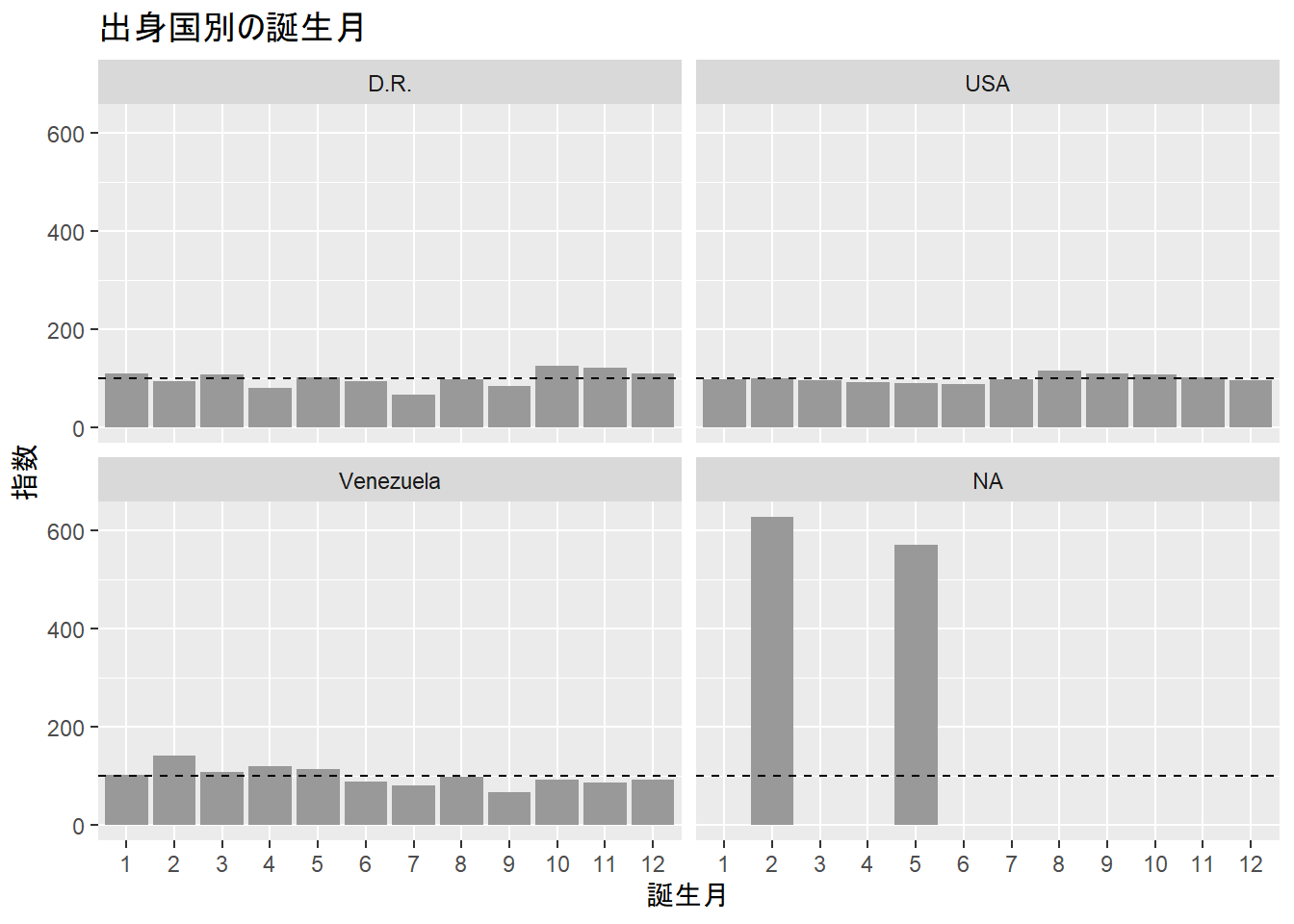
注意
- 比べているのはメジャーリーガーの中での月別分布です. 本来は 米国の一般人口の誕生月分布と比べるべきですが, 手元にデータがありません. 一般人口にも季節性があるので (夏から秋にかけて多い), ここで見た偏りの 一部はそれで説明できる可能性があります.
- ただし一般人口の季節性は数%程度で, ここで見た30% の差を説明しきるものではありません.
- リトルリーグの区切りは2006年に段階的に変更されています. ここでは 全年代をまとめて見ているので, 古い区切りの影響が中心です.
日本のプロ野球選手についても同じことを調べています (プロ野球選手の誕生日). 日本は学年の区切りが4月なので, ピークもずれるはずです.